Using 51Degrees.Mobi Foundation for accurate mobile browser detection on ASP.NET MVC 3
Mobile devices continue to grow in popularity as a way to access the Web. If you’re building any kind of public-facing site, you probably way to make it look and behave well on mobiles just as on traditional desktop browsers.
ASP.NET MVC allows for lots of possible architectures to support this:
- You could render different views for mobiles, as in Scott Hanselman’s recent post
- You could have a separate MVC area for mobiles, so you can handle their requests using different controller logic as well as different views
- You could simply have a separate layout/master page for mobiles, but otherwise let them share the same controller logic and views as desktop browsers
Hopefully soon we’ll publish some updated and more detailed guidance about these options, but for now this blog post is about option (3) – the simplest of them all.
Setting up a mobile-specific Razor layout
One of the really neat aspects of the Razor view engine (the default in ASP.NET MVC 3) is that a lot of it can be controlled by procedural code, not just declarative statements. So, if you want to implement custom logic to control layout selection, just add some logic to ~/Views/_ViewStart.cshtml. For example, change this:
@{
    Layout = "~/Views/Shared/_Layout.cshtml";
}
… to this:
@{
    Layout = Request.Browser.IsMobileDevice
        ? "~/Views/Shared/_LayoutMobile.cshtml"
        : "~/Views/Shared/_Layout.cshtml";
}
… and now it will attempt to use _LayoutMobile.cshtml for requests from mobiles. Next, of course, you’ll need to actually create _LayoutMobile.cshtml. To get started, you can just copy & paste the existing _Layout.chtml file, changing its name. To ensure we can tell the difference between the two, I’ll modify the “title” element to display a special message for mobiles:
<div id="title">
    <h1>My *mobile* app</h1>
</div>
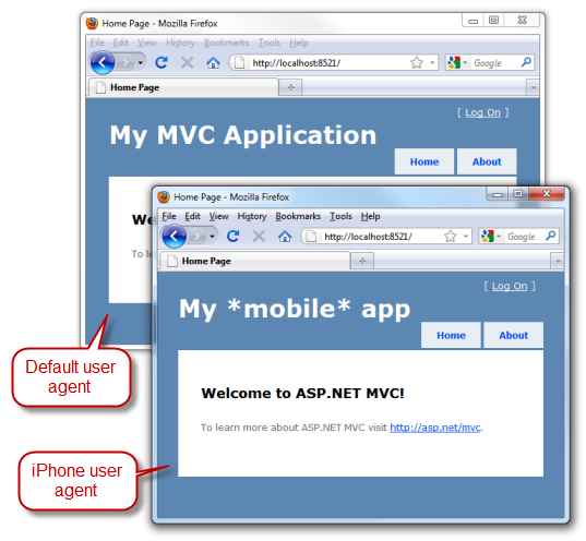
Time to check it works. Perhaps the quickest way to simulate a mobile device (without downloading any emulators) is by using Firefox and its User Agent Switcher add-on: it already knows how to simulate the iPhone’s user agent string, for example. Here’s how my home page renders, first with the default Firefox user agent string, and second simulating the iPhone’s user agent string:
Spot the difference ![]()
At the point, you might think we’re done. Surely from here it’s just a matter of customizing _LayoutMobile.cshtml to better suit the small screen of a mobile device, right? Well, kind of. But how does Request.Browser.IsMobileDevice actually work? Is it always right?
Some popular mobile devices/browsers won’t be detected this way
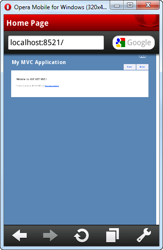
In case you don’t know, Request.Browser is a core ASP.NET platform feature that can give you a lot of information about the type and capabilities of the browser making the current request. It works by comparing the incoming User-Agent header against regular expressions in a set of built-in .browser files. ASP.NET 4’s browser files are recent enough to detect iPhone, but not Opera Mobile or Android. For example, if you download the Opera Mobile emulator and visit the page we just created, here’s what you’ll see:
If you can read the tiny text, you’ll see it doesn’t say “My *mobile* app”.
One way to improve this is to add your own .browser files for newer devices and browsers – accounting for the many variations in their user agent strings. Then Request.Browser.IsMobileDevice could successfully recognize Opera Mobile. But if you don’t want to do all that work?
Improving device detection using the 51Degrees.Mobi package
51Degrees.Mobi Foundation is an open source .NET project that enhances Request.Browser so it gets its information from Wireless Universal Resource File (WURFL) – one of the most comprehensive and up-to-date databases of mobile device information. The great news is that 51Degrees.Mobi Foundation is now available as a NuGet package, so it’s incredibly easy to install and update.
If you haven’t already installed the NuGet package manager, do so right away! Next, install 51Degrees by entering the following into the NuGet Package Manager Console:
Install-Package 51Degrees.mobi
Easy! This does the following to your project:
- Adds a reference to FiftyOne.Foundation.dll, the assembly containing the 51Degrees logic
- Adds AppStart_51Degrees.cs to the root of your project. This enables the 51Degrees mobile detection provider, which populates Request.Browser information whenever you ask for it
- Adds a recent copy of the WURFL device list to your project at ~/App_Data/wurfl.xml.gz
- Adds a folder, ~/Mobile/ containing a Web Form that displays information about the device. We don’t want this in an ASP.NET MVC application – just delete the ~/Mobile folder that it added.
- Adds a section to your Web.config file that configures 51Degrees.Mobi Foundation with some default settings. One of its default settings is to redirect mobile browsers to the URL ~/Mobile. This would be useful if you were setting up an MVC Area called “Mobile” for mobile browsers, but since we’re just changing the master page, we don’t want this redirection to happen. Disable it by modifying Web.config: Find the
element inside , and comment it out or delete it.
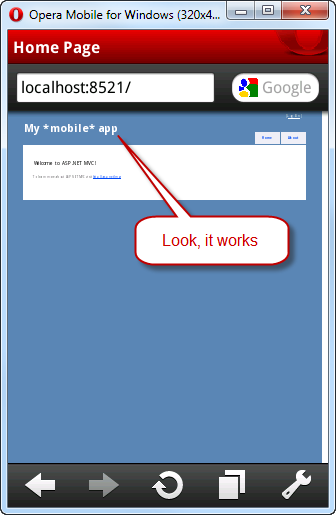
Now you’ve got a much more up-to-date device database. Here’s what you’ll see if you reload the site in Opera Mobile emulator:
You can download newer versions of the WURFL database to pick up newly-released mobile devices and browsers at any time from its page on SourceForge. Whenever you download a new version, install it by copying it to the location ~/App_Data/wurfl.xml.gz, overwriting your previous version of that file. Note that WURFL does not yet appear to detect Windows Phone 7 WURFL does detect Windows Phone 7 already.
Improving the layout for small screens
OK, we’ve got as far as distinguishing mobiles from desktop browsers and rendering views with different Razor layout file. It’s beyond the scope of this blog post to explain all the dozens of HTML and CSS tricks you can use to create layouts that look great on the widest range of mobiles, but here’s one I want to mention:
When modern mobile browsers render web pages, they lay it out on a virtual “viewport” that by default is about as wide as a typical desktop browser window. Then, after rendering the page, they scale down the output to fit on the tiny device screen. That’s why the preceding Opera Mobile screenshots have really tiny body text: the HTML page was laid out for a screen around 1000px wide and then scaled down. The user is expected to zoom in and pan around to get a closer look at the text.
Mobiles do this as a workaround for the fact that most web pages assume you’re using a desktop browser. If the mobile didn’t do this, typical web pages wouldn’t fit horizontally and would end up getting hideously mangled. But if you’re designing a layout especially for mobiles, you’ll take account of the much smaller width and spare the user all that awkward zooming and panning.
How can you tell the mobile not to use a wide virtual viewport, but instead to lay out the page to match the device’s actual (narrow) width? You can use the unofficial “viewport” meta tag. Here’s an example. Add the following to the <head> section of _LayoutMobile.cshtml:
<meta name="viewport" content="width=device-width">
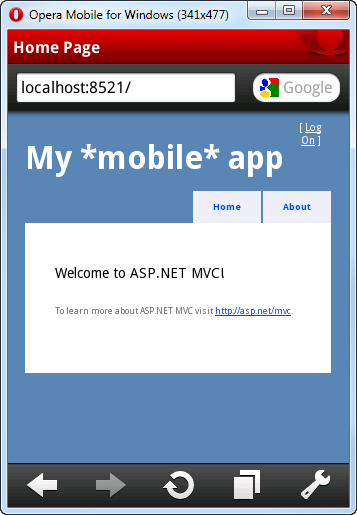
Now if you reload the page in Opera Mobile emulator, here’s what you’ll see:
Much better! The body text is now pretty much readable, and the user only needs to scroll vertically (not horizontally). No zooming required. The “viewport” meta tag is respected by most recent mobile devices/browsers, including Windows Phone 7 and iPhone. Read more about how iPhone interprets it here.
From here on, it’s up to you to customize your mobile layout, perhaps using a different CSS stylesheet, to look as neat as possible on mobiles. Of course, you can also inspect Request.Browser.IsMobileDevice in other parts of your code too (e.g., controllers or filters) if you need to vary your logic further.


