In the previous post, I showed a simple yet very useful and robust CSS technique for creating full-height layouts for web-based applications. To recap, it means you can subdivide both the width and height of the screen into a arbitrarily nested set of panes, each of which can scroll independently. This is useful whether you’re building apps for desktop browsers, for tablets, or for phones.
Not amazingly exciting just yet, but there’s more… 
One of the other reasons for defining pane positioning using those particular CSS rules is that it becomes trivial to have multiple different content panes that can populate any given pane container, then to change which pane is visible within a container, and even to animate the transitions during those changes.
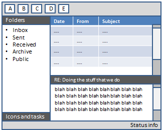
For example, here’s a layout involving a fixed header, a fixed footer, and two scrollable body regions (laid out using the same CSS rules as defined in the previous post):
<div class="header row">
    <h2>My header</h2>
</div>
<div class="body row">
    <div class="first pane scroll-y">
        <p>This is the first body view</p>
    </div>
    <div class="second pane scroll-y">
        <p>This is the second body view</p>
    </div>
</div>
<div class="footer row">
    <p>My footer. Could put icons here.</p>
</div>
This will lay out as follows, with the first body pane and second body pane occupying the same area on the screen:

Then, you can trivially switch between the two body panes just by controlling their visibility (e.g., by using $(“.first.pane”).hide() and $(“.second.pane”).show()).
Animating the transitions
Instead of just hiding and showing panes instantly, you can cause them to fade in/out or even to slide in and out. This pretty well replicates an aspect of the UI experience familiar to users of touch-based smartphones and tablets.
However, JavaScript-based animation mechanisms (such as $.animate in jQuery) aren’t as smooth as I’d like. They tend to give low frame rates, as the browser has to run custom JavaScript to compute the positions of elements for each frame. Fortunately since we’re controlling the layout purely using CSS, it’s both easy and robust to use pure CSS 3 animated transitions, giving silky-smooth results on devices that support hardware accelerated CSS transforms (e.g., iPhone and iPad), exactly like a native application.
To make this easy to reuse, I created a small bit of JavaScript boilerplate (about 1kb gzipped) that exposes functions for triggering pane transitions, being sure to take full advantage of hardware acceleration where available. For example, you can write:
// Initial pane visibility
$(".first.pane").showPane();

// Navigation between panes
$(".first.pane button").clickOrTouch(function () {
    $(".second.pane").showPane({ slideFrom: 'right' });
});
$(".second.pane button").clickOrTouch(function () {
    $(".first.pane").showPane({ slideFrom: 'left' });
});
… and then if you click any button in the first body pane, the second body pane will slide in smoothly from the right, and vice-versa. Note that although this code uses looks as if it uses jQuery, it doesn’t – it actually uses XUI instead (a very lightweight JavaScript framework that implements a fraction of the jQuery API in a fraction of the space), but you could equally do similarly with jQuery.
The boilerplate code offers the following transitions:
- slideFrom – causes the target pane to slide in from the specified direction, and simultaneously the current pane to slide out in the opposite direction
- coverFrom – causes the target pane to slide in from the specified direction. The current pane stays still, getting covered over by the target pane.
- uncoverTo – causes the current pane to slide out in the specified direction, revealing the target pane underneath
- default – instantly shows the target pane and hides the current pane
… and it works on IE7+ (including WP7 Mango), iOS, Firefox, Chrome, Safari, Opera, and probably others. For browsers that support hardware-based CSS3 transforms, like Safari on iOS 4+, it will be used and is impeccably smooth; others will use unaccelerated CSS3 transforms, and for those that don’t support CSS3 transforms, it falls back on JavaScript-based animation.
Also notice the “clickOrTouch” event – on browsers that support touch events (e.g., iOS Safari), this fires the instant your finger comes into contact with the screen (and hence is noticably faster than a regular click), whereas on non-touch devices, it’s equivalent to a regular click (i.e., when you release the mouse).
Runnable examples
Here’s a phone-styled example just showing how you can transition the contents within a given pane, or you can transition the contents of the entire screen. Note that this is an iframe you can interact with, not just a pretty picture
Also: Run full screen (e.g., to try it on a phone)
Similarly, here’s a tablet-styled example showing how transitions work just the same in arbitrary sub-panes as well.
Also: Run full screen (e.g., to try it on a tablet device)
Note: To be clear, I’m not starting a new open source project here. These are experiments in mobile-friendly app layouts – I’m blogging the results just in case it’s useful to someone else! In the next post, I’ll focus on managing navigation history within each pane, so you can easily let a visitor go “back” and “forwards”.